top of page

Creative Brand Strategy

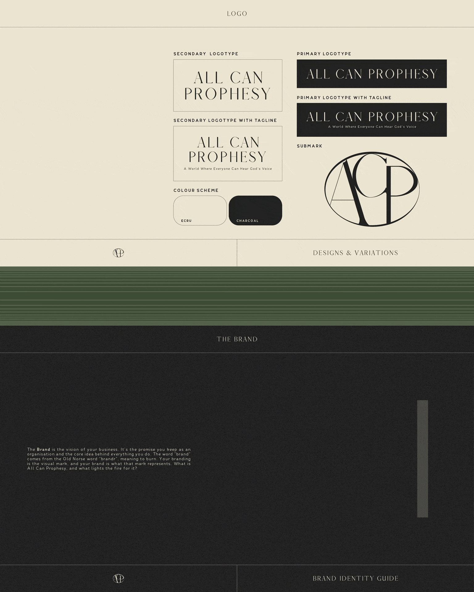
Project: All Can Prophesy (ACP)

Creating a refined, modern brand identity to reflect their professional yet faith-driven approach.


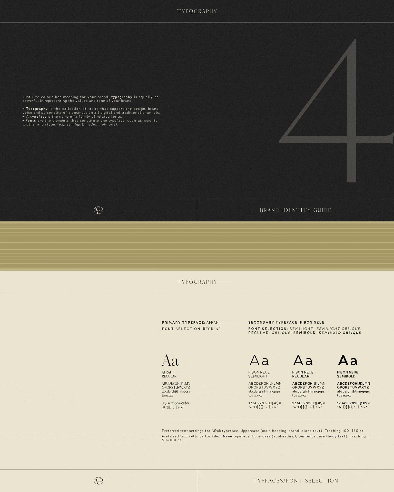
A minimalist design language was applied across all touchpoints—from business cards to website skins—blending clean typography, dynamic shapes, and impactful copywriting. The result is a brand identity that feels both spiritually grounded and sophisticated.


Services: Brand Identity  |  Image Curation  |  Art Direction

Aesthetic: Sophisticated, Professional, Minimal & Clean.

Client Site: allcanprophesy.com

All Can Prophesy wordmark logo, represented by the letters A, C & P encased together in an oval. The logo has a varying line density and is charcoal black set against a neutral, ecru textured background.
ACP's wordmark logo with accompanying brand tagline: A World Where Everyone Can Hear God's Voice. Set against a background of a consulting session between two casually-dressed men on s couch with an accompanying table.
ACP wordmark logo set against minimal layered concrete with soft sunlight, followed by the brand colour scheme of ecru, charcoal, light olive & pine green.
An excerpt of the ACP brand guide; featuring logo variations & brand guide description.
An excerpt of ACP brand guide; featuring curated typography.
ACP's print collateral, featuring company business cards. Both sides feature contrasting colours of charcoal black & ecru.
bottom of page